


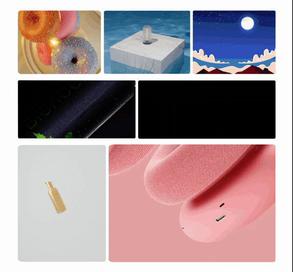
Complete brand identity from scratch
Logo · Colour · Type · Collateral · Social
Adobe Illustrator · 14 design slides
A scalable, consistent, ownable visual language for a new-to-market brand.
Primary mark, secondary mark, icon-only, and mono versions — a complete logo family built for every context from favicon to billboard.
Logo DesignA defined palette with primary, secondary, and neutral tones — each colour chosen with purpose to communicate brand personality.
Colour SystemFont pairing with defined hierarchy — display, body, and accent weights — ensuring typographic consistency across all brand communications.
Type HierarchyPatterns and graphic elements that extend the brand language beyond the logo — creating depth and ownable visual details.
Visual IdentityIdentity applied to stationery and collateral — proof-of-concept for the real world, showing how the brand lives beyond the design file.
Brand CollateralScalable templates that maintain brand consistency while adapting to different content types — a system a team can use without breaking the brand.
Digital · SocialBuilding Tilliput taught me to design decisions rather than visuals — every choice had to work as a rule that scales to an entire brand.
A brand identity isn't finished when it looks good in one context — it's finished when it holds together across every application without intervention.
Clear brand parameters — colour, type, tone — didn't limit creativity. They focused it. The best identity work happens within a clear conceptual framework.